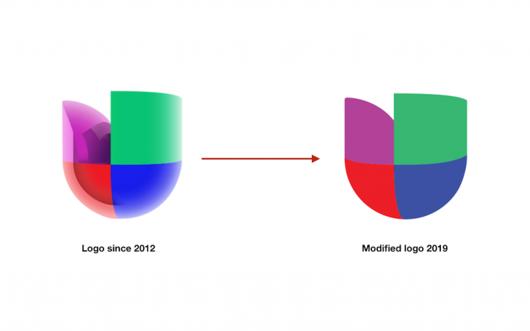
Univision is sprucing up its logo as part of a brand refresh. The update was unveiled today on-air across the network.
The modification is the first touch-up since the company revamped its logo in 2012 to a 3-D image.
In its newest iteration, Univision’s emblem reverts from a 3-D logo to a flat logo, with some minor tweaks.
If you take a close look, you’ll notice the new logo includes a reduced size of the green piece, eliminated reflections and simplified the gradients.
According to the company, the goal was to “give it a cleaner, more modern appearance and improve its usability” across all of its platforms, and to “better align the look of the network and local stations in a cohesive manner.”
The change is part of a brand campaign refresh that supports Univision’s internal positioning “Bringing together hispanics on the rise.”
In addition, plans are in the works to give Univision’s local news a modernized look in the summer.

It looks the same to me, quality og programming still bad.
What about that “pu” emoticon instead?
It was difficult to deal with it, even kindergartners had problems drawing it.
Oh boy! They’re trying to keep up with the cook kid (Telemundo)… but this will require more than a logo modification! They’re going backwards… 2012 logo was cooler in 3D than this flat and simplistic version. #Pobrecitos
The new logo looks TERRIBLE. The old logo was beautiful in 3D and looked futuristic.