Univision is sprucing up its logo as part of a brand refresh. The update was unveiled today on-air across the network.
The modification is the first touch-up since the company revamped its logo in 2012 to a 3-D image.
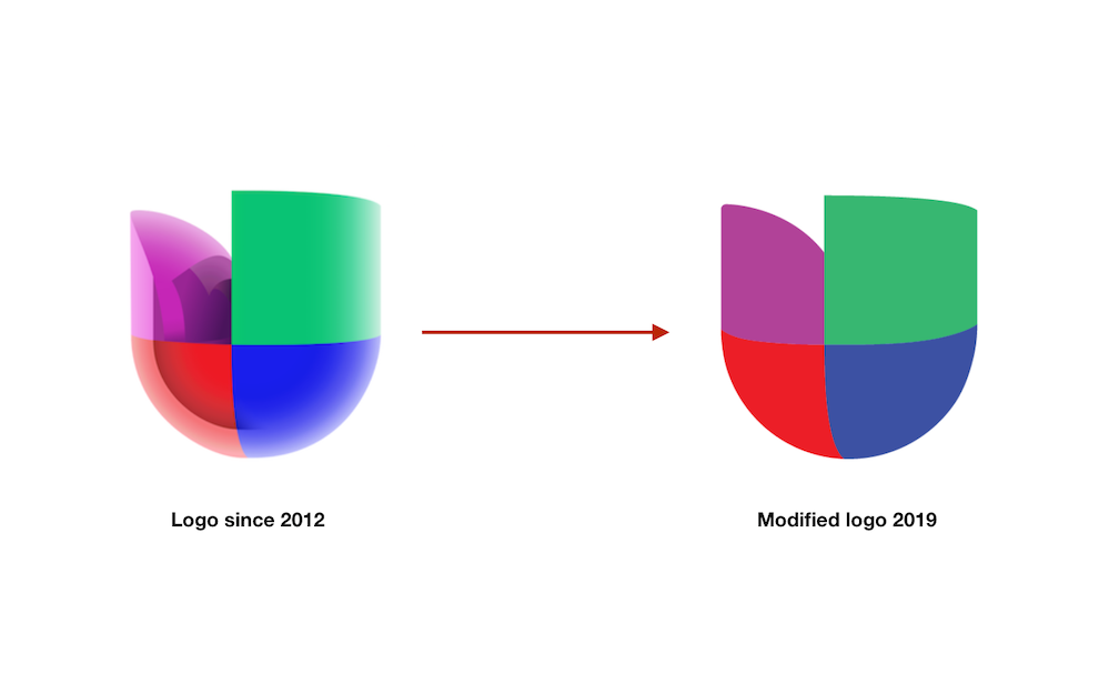
In its newest iteration, Univision’s emblem reverts from a 3-D logo to a flat logo, with some minor tweaks.
If you take a close look, you’ll notice the new logo includes a reduced size of the green piece, eliminated reflections and simplified the gradients.
According to the company, the goal was to “give it a cleaner, more modern appearance and improve its usability” across all of its platforms, and to “better align the look of the network and local stations in a cohesive manner.”
The change is part of a brand campaign refresh that supports Univision’s internal positioning “Bringing together hispanics on the rise.”
In addition, plans are in the works to give Univision’s local news a modernized look in the summer.


