Telemundo today unveiled a new logo and announced the network will launch a new branding campaign for the fall that will include a new tagline and on-air identity.
After 20 years, the network has departed from its use of a traditional blue “T.” The new logo is red. Telemundo says its new positioning platform “aims to capture the duality of Telemundo’s audience, balancing the strong connection to their Latin roots with their contemporary mindset of living in the U.S.”
Although it didn’t release the actual tagline, the network revealed its brand statement as “Brave New Telemundo.”
As part of the network’s revamping campaign, Telemundo Digital announced the launch of its Entertainment App. The Telemundo Entertainment App will feature bilingual content, marking the first time Telemundo and mun2 partner on a mobile app. Users will be able to access Telemundo’s full programming schedule and add calendar reminders to their phone about program air dates and times and share content with others.
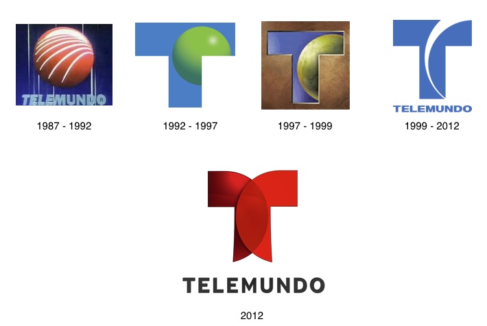
Check out the network’s logo evolution from 1987 to today:


¿Quien hizo el nuevo logo de Telemundo? ¿Un niño de primaria? Hasta yo podría hacer uno mejor en paint. El nuevo logo de Telemundo es una porquería.
El nuevo logo de Telemundo, representa al Nuevo accionista mayoria rio de NBCUniversal, Comcast. El color rojo, es el color Oficial de Comcast. Vamos a ver si Telemundo se impulsa aun mas.
Hahaha! That logo is garbage! What kind of Graphic Designer would submit this and still have the b*lls to show his face in public??? Big mistake Telemundo. I’m all for updating but at least make it worthwhile! What a joke. It’s not too late! Change it!!